The Right Vehicle Wrap Colour Can Change the Whole Mood of a Brand
Colour does a lot more than people give it credit for. Before someone reads a business name, before they notice a phone number, before they even understand what the vehicle is advertising, they usually notice the colour first. It is quick, emotional, and a little instinctive. A clean black wrap can feel serious. A bright orange one feels energetic. A soft grey may look modern and calm.
That is why choosing vehicle wrap colour is not just about picking something that looks nice on a screen. A vehicle lives in the real world. It moves through traffic, sits under sunlight, gets seen in parking lots, and catches attention from different angles. The right colour helps the vehicle feel memorable without making the design messy or hard to read.
Colour Sets the First Impression
The best wrap colors usually match the personality of the business or owner. A luxury service brand may lean toward deep tones, satin black, champagne, or understated navy. A food truck might need something warmer and more playful. A construction or home service company may choose bold contrast so the name can be seen quickly from the road.
It is also worth thinking about visibility. Some colours look beautiful up close but disappear in shade or traffic. Others stand out too much and can feel loud if not balanced properly. A smart wrap uses colour to support the message, not overwhelm it.
Simple Palettes Often Work Better
There is always a temptation to use too many colours. After all, wrap films and printed graphics offer almost endless options now. But more colour does not always mean better branding. Sometimes it just creates noise.
A clean two- or three-colour palette can make a wrap easier to read and more professional. Contrast is especially important for business vehicles. If the phone number blends into the background or the logo gets lost in a busy pattern, the wrap is not doing its job. People often see vehicle graphics for only a few seconds, so clarity has to come first.
When Metallic Finishes Make Sense
For a more premium or eye-catching look, metallic finishes can add depth without needing a complicated design. They reflect light in a subtle way, giving the vehicle a richer appearance as it moves. A metallic charcoal, deep blue, bronze, or silver wrap can feel polished and modern, especially on cars, trucks, and high-end service vehicles.
The key is restraint. Metallic does not have to mean flashy. Used well, it can make a brand look more refined. Used poorly, it may feel distracting or overdone. Lighting also matters, because metallic surfaces can look different in bright sun, shade, or at night. That shifting visual texture is part of the appeal.
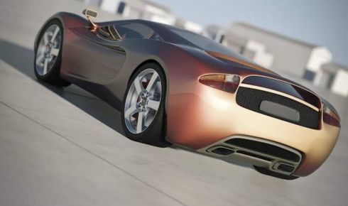
Colour That Changes with the Angle
Some wraps are made to create a stronger visual reaction, and color-shifting wraps are a good example. These films change appearance depending on viewing angle and lighting, moving between shades like purple and blue, green and gold, or red and bronze. They can make a vehicle feel custom, bold, and hard to ignore.
This style works especially well for personal vehicles, promotional cars, show vehicles, and brands that want a more expressive identity. For everyday commercial use, it needs careful planning. If the colour shift makes the logo hard to read or distracts from the message, it may reduce the wrap’s marketing value. The design should still serve the brand first.
Finish Changes the Feeling Too
Colour is only one part of the decision. Finish matters just as much. Glossy wraps feel clean and bright, often closest to a fresh paint look. Matte finishes are more understated and modern. Satin sits between the two, giving a soft sheen without full shine.
A black vehicle in gloss, matte, and satin can feel like three completely different designs. That is why samples are useful. Seeing a film in real daylight, not just on a phone screen, can prevent surprises. Vehicle shape also affects how the finish looks, especially on curved panels and large surfaces.
Maintenance Should Be Considered Early
Some colours and finishes need more care than others. Matte and satin surfaces can show oily fingerprints or marks differently than gloss. Dark colours may reveal dust, water spots, or scratches more easily. Lighter colours can hide heat and dust better but may show staining if not cleaned.
That does not mean certain colours should be avoided. It simply means the owner should know what to expect. A wrap is easier to enjoy when its maintenance needs match how the vehicle is actually used.
Good Colour Choices Make Branding Last
A wrap should still feel right months after installation. Trendy colours can be fun, but for business vehicles, the best choice is usually one that supports long-term recognition. Customers should be able to connect the vehicle with the brand quickly and consistently.
In the end, choosing a wrap colour is part design, part strategy, and part personal taste. The right shade can make a vehicle look sharper, more professional, or more memorable. And when the colour, finish, branding, and readability all work together, the vehicle becomes more than transportation. It becomes a moving expression of identity.
